From the client
"We worked with Shona at The Rainbow Vault when we needed our Hygiene Audits App re-designed. She understood our brief clearly and we really enjoyed working together on the App. We were provided clickable prototypes and an easy to use commenting link for revisions. It was a breeze. She worked closely with our developer to assure all worked smoothly taking into account the user’s experience throughout. This relationship grew onto further design projects such as pitch deck designs, documents, social images, infographics and mockups which we are delighted with. We wouldn’t hesitate to recommend The Rainbow Vault if you’re looking for a friendly, professional service."
Glenda Hahn - Hygiene Audits
App Design and Web Design
The Brief
Hygiene Audits provides hygiene software for care homes and hospitals. Their app provides accountability for Infection Prevention and Control. The goal when the company came to us was to re-design the look and feel of their App, to provide a more easy to use, organised layout that would be much more engaging and straightforward to the user while adding some fun and personality.
This app re-design project went very well and like with several other clients, Hygiene Audits then wanted us to work on various other projects such as brochure and presentation design, ads/social media, document design, print work, infographics and even video explainers. It was a pleasure working with them and we enjoyed this project throughly.
Client
Hygiene Audits
Industry
Health Tech
Process
Art Direction
App Design
Presentation Design
UI/UX
Website Design
Mockups
Link / Year
2021/2022
APP DESIGN
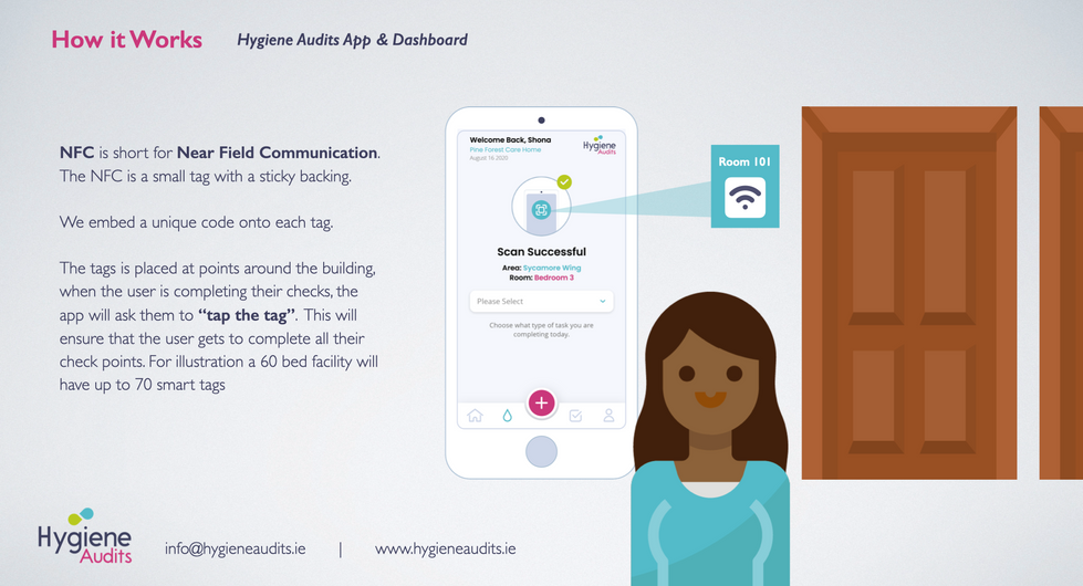
The former app design we were shown lacked that polished feeling that the client was seeking along with buttons, fonts and colours not being consistent with the brand itself. The purpose of the Hygiene Audits app was to digitise cleaning schedules and allow cleaners and maintenance workers to be able to see all rooms in a hospital/care home that needed cleaning or servicing, and to scan an NFC tag outside each room to see what tasks needed to be carried out, and mark them as complete.
The nurses station computer could also see an overall admin view of this. The feedback from users was that the actions and choices within the app wasn’t always clear and while the app had so many useful functions, they weren’t always obvious. We needed more concrete clarifications when a task was completed and obvious signals when something needed to be attended to. We completely overhauled the look and feel of the app and took the brand colours into consideration, focusing heavily on them, added some fun graphics to really make even menial tasks seem fun. Utilising colours and symbols really brought the app to life. Consistent fonts, components and clear call to actions was of utmost importance and made for a great user experience.

The Website
We were asked to design a concept website design that had to reflect the look and feel of the app, remaining clean and consistent. We wanted to showcase the app and its features so the user really gained an understanding of its powerful uses, how it can save huge amounts of time money just by digitising hygiene practices, and how simple it is to use. The design was well received by the client for future use if they decide to develop it.


Graphic Design
The Hygiene Audit logo while strong in appearance, lacked complimentary colours, graphics and a suite of icons to choose from. While we worked on several promotional ads, print work etc. for them we built up a style that really encompassed the brand’s personality. Nurses, hospitals, NFC tags and icons that married together both the app’s concept and brand’s colour scheme. Our work consisted of but was not limited to: business case document design, print design, ads, linkedin posts and user guides. Check out some bits below!


concept designs
While the website was a concept piece, we also were asked to create a concept mock up for the dashboard/iPad version of the app. This would be the overall dashboard the nurses use in their station. We also designed a mock up of a visual overview of the hospital/care home beds and what status each room had.


PRESENTATION DESIGN
Naturally after thoroughly working through the app re-design, creating presentations for Hygiene Audits with an in-depth understanding of the business model gave us a huge upper hand. We always design presentations and pitch decks with the idea that no one reads large bodies of text. If the reader/viewer does not 80% get the concept from flicking through the slides then we have not done our job right. Layout, text hierarchy and graphics are so important to really hit home with your business idea. And Hygiene Audits ended up wining several investment pitches.
VIDEO EXPLAINER
The video explainers were a great way to showcase the app, how it works and also the massive benefits to a care home/hospital. The aim was to create an easily digestible walk-through of the app, sprinkle in some uplifting music and add minimal text to compliment the walk-through. Check it out below!


